
UX-driven web solutions for small businesses & founders
Lowkey Web Studio creates websites as digital experiences with effortless UX, thoughtful interactions, and lasting impressions.
Lowkey Web Studio creates websites as digital experiences with effortless UX, thoughtful interactions, and lasting impressions.
If this page felt easy and enjoyable to navigate, we're probably a good match.
We help you define your vision, map your journey, and create a clear roadmap for success that aligns with your business goals. Our strategic approach ensures every decision is informed by data and focused on delivering real value.
Through comprehensive discovery sessions and market analysis, we identify opportunities, understand your competitive landscape, and establish a foundation for sustainable growth. We don't just create plans—we create actionable strategies that drive results.
Deep-dive workshops to understand your objectives, target audience, and market positioning.
Comprehensive market research to identify opportunities and strategic positioning.
Prioritized, phased approach with clear milestones and measurable outcomes.
Define success metrics and measurement systems for data-driven decision making.
We research, plan, and structure user experiences that drive engagement and conversions. Our UX planning process ensures every interaction is intentional, user-centered, and optimized for your business goals.
Through user research, information architecture, and iterative prototyping, we create experiences that not only look great but perform exceptionally. We map user journeys, identify friction points, and design seamless flows that convert visitors into customers.
Interviews, surveys, and usability testing to understand user needs and behaviors.
Intuitive content organization with sitemaps and user flows that guide users effectively.
Low-fidelity wireframes and interactive prototypes to test concepts before development.
Journey mapping and friction point identification to create seamless conversion flows.
We create beautiful, functional interfaces that reflect your brand and delight your users. Our design process balances aesthetics with usability, ensuring every visual element serves a purpose and reinforces your brand message.
From visual identity to responsive interfaces, we craft cohesive design systems that work beautifully across all devices. Every button, form, and interaction is thoughtfully designed for clarity, ease of use, and brand consistency.
Cohesive brand systems with color palettes, typography, and visual language.
Pixel-perfect interfaces that balance aesthetics with functionality and clarity.
Consistent experiences across all devices, from mobile to desktop screens.
Reusable component libraries and style guides for scalable, consistent design.
We bring your vision to life with modern development practices and seamless deployment. Our launch process ensures your site is fast, secure, and ready to perform from day one.
From clean, maintainable code to rigorous testing and reliable hosting, we handle every aspect of deployment. After launch, we monitor performance, fix issues, and provide ongoing support to ensure your site continues to excel.
Cutting-edge technologies and best practices for clean, maintainable, performant code.
Rigorous testing across devices and browsers to ensure flawless user experiences.
Reliable hosting platforms with proper security, backups, and monitoring systems.
Ongoing monitoring, issue resolution, and performance optimization after launch.
We only craft quality products and therefore have limited spots for each quarter of a year. Let's discuss your project and see if we're a good fit for you.
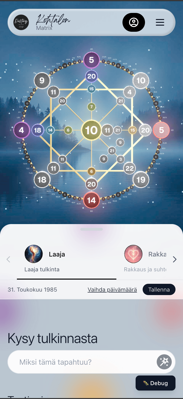
When a client came to me with a numerological SaaS idea, they had a clear vision but needed help standing out. Most competitors were using the same WordPress plugin with basic charts. I saw an opportunity to create something truly different.
Instead of a static chart, I designed a custom 3D interactive matrix that users could explore. This required significant performance optimization, but the result was an immersive experience that immediately differentiated the product from competitors.
Since the product was primarily marketed through social media, I designed mobile-first. The desktop experience mirrors mobile with a ¾ width matrix and ¼ width content card, creating consistency across devices. On mobile, the content card overlaps the matrix with rounded corners and a drag handle, creating an intuitive, app-like experience.
Challenge: Client had hundreds of pages of content in Word documents with no clear structure. Needed a system flexible enough to handle varying content while being simple enough for a non-technical user to manage.
Approach: Built a four-layer content system (Product, Section, Context, Data) that separated structure from data, allowing the client to manage complex content independently while maintaining a clean, organized user experience.
When building for non-technical users, the balance between flexibility and simplicity is crucial. Too much power can be overwhelming, but too little structure creates limitations. The solution was a layered system that guides users while giving them control.
"Remarkably professional, skilled, and customer-focused. Nikke made sure everything was clear, transparent, and delivered exactly right - even taking the time to meet in person and plan our website together. Truly grateful for the work on our project."
Ready to transform your online presence? Get in touch and let's discuss your project.